[03. 패키지 - Matplotlib] (3) 사용법, (4) 함수
작성자 : kim2kie
(2023-02-19)
조회수 : 1489
[참조]
- 공학자를 위한 Python, 조정래, 2022: 4. Matplotlib
https://wikidocs.net/14570 - Dookie Kim, Python: From Beginning to Application, 2022
https://www.dropbox.com/s/oa86j9ap62esmtz/Python.pdf?dl=0
Matplotlib은 그래프를 그리는 패키지이다.
(3) 사용법
1) matplotlib 구동 방식
2) axes vs axis
3) subplot
(4) 함수
1) getp()
2) gca(), gcf(), axis()
3) size와 face color
4) savefig()
5) set_aspect(), set_visible(), set_frame_on()
6) 두 개의 y축: ax2 = ax1.twinx()
7) 도형 그리기
8) subplot 위치 및 크기 조정: subplot2grid()
9) 대수그래프: plt.xscale("log")
(3) 사용법
1) matplotlib 구동 방식
a) API 객체 방식: matplotlib의 객체지향라이브러리 활용
b) plt 함수 방식: 객체지향 API로 구현한 matplotlib.pyplot 모듈의 함수
- API 객체는 다음 3가지 객체로 구성되어 있다
a) FigureCanvas: 그림 캔퍼스
b) Renderer: FigureCanvas에 그리는 도구
c) Artist: Renderer가 FigureCanvas에 그리는 방법
- Artist 객체의 2가지 유형은 다음과 같다.
a) Primitives: Line2D, Rectangle, Text, AxesImage, Patch 등으로 캔버스에 그려지는 객체
b) Containers: Axis, Axes, Figure 등으로 primitives가 위치할 대상
-
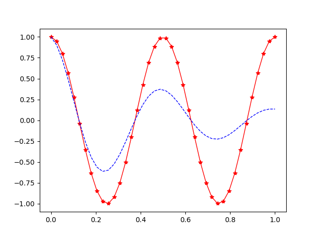
Ex) API 객체 방식
import matplotlib.pyplot as plt
import numpy as npX = np.linspace(0,1,40)
Y1 = np.cos(4*np.pi*X)
Y2 = np.cos(4*np.pi*X)*np.exp(-2*X)fig = plt.figure() # figure 객체 생성
ax = fig.subplots() # axes 생성
ax.plot(X,Y1,'r-*',lw=1) # axes에 plot() 함수
ax.plot(X,Y2,'b--',lw=1) -
Ex) plt.plot 함수 방식
import matplotlib.pyplot as plt
import numpy as npX = np.linspace(0,1,40)
Y1 = np.cos(4*np.pi*X)
Y2 = np.cos(4*np.pi*X)*np.exp(-2*X)plt.plot(X,Y1,'r-*',lw=1) # plt의 plot() 함수
plt.plot(X,Y2,'b--',lw=1) -
Ex) API 객체 방식 + plt.subplots 함수 방식
import matplotlib.pyplot as plt
import numpy as npX = np.linspace(0,1,40)
Y1 = np.cos(4*np.pi*X)
Y2 = np.cos(4*np.pi*X)*np.exp(-2*X)fig,ax = plt.subplots() # plt.subplots() 함수는 figure 객체 생성, ax=figure.subplots()를 호출
ax.plot(X,Y1,'r-*',lw=1)
ax.plot(X,Y2,'b--',lw=1)
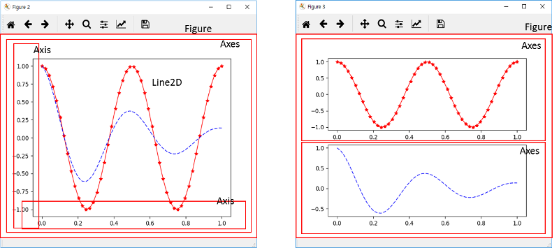
2) axes vs axis
- Axes
plot으로 나타낸 하나의 그래프(또는 차트). 각각의 Axes는 개별적인 제목 및 x, y label을 가질 수 있다.
- Axis
x축, y축의 범위
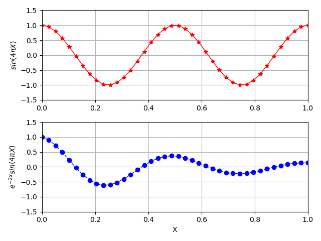
3) subplot
-
Ex) API 객체 방식
import matplotlib.pyplot as plt
import numpy as npX = np.linspace(0,1,40)
Y1 = np.cos(4*np.pi*X)
Y2 = np.cos(4*np.pi*X)*np.exp(-2*X)fig = plt.figure()
ax = fig.add_subplot(2,1,1)
ax.plot(X,Y1,'r-*',lw=1)
ax.grid(True)
ax.set_ylabel(r'$sin(4 \pi X)$')
ax.axis([0,1,-1.5,1.5]) # x축, y축의 범위ax = fig.add_subplot(2,1,2)
ax.plot(X,Y2,'b--o',lw=1)
ax.grid(True)
ax.set_xlabel('X')
ax.set_ylabel(r'$ e^{-2x} sin(4\pi X) $') # raw 문자열
ax.axis([0,1,-1.5,1.5]) x축, y축의 범위fig.tight_layout()
plt.show() -
Ex) plt.subplot 함수 방식
import matplotlib.pyplot as plt
import numpy as npX = np.linspace(0,1,40)
Y1 = np.cos(4*np.pi*X)
Y2 = np.cos(4*np.pi*X)*np.exp(-2*X)plt.subplot(2,1,1)
plt.plot(X,Y1,'r-*',lw=1)
plt.grid(True)
plt.ylabel(r'$sin(4 \pi X)$')
plt.axis([0,1,-1.5,1.5])plt.subplot(2,1,2)
plt.plot(X,Y2,'b--o',lw=1)
plt.grid(True)
plt.xlabel('X')
plt.ylabel(r'$ e^{-2x} sin(4\pi X) $')
plt.axis([0,1,-1.5,1.5])plt.tight_layout()
plt.show() -
Ex) API 객체 방식 + plt.subplots 함수 방식
import matplotlib.pyplot as plt
import numpy as npX = np.linspace(0,1,40)
Y1 = np.cos(4*np.pi*X)
Y2 = np.cos(4*np.pi*X)*np.exp(-2*X)fig,ax = plt.subplots(2,1)
ax[0].plot(X,Y1,'r-*',lw=1)
ax[0].grid(True)
ax[0].set_ylabel(r'$sin(4 \pi X)$')
ax[0].axis([0,1,-1.5,1.5])ax[1].plot(X,Y2,'b--o',lw=1)
ax[1].grid(True)
ax[1].set_xlabel('X')
ax[1].set_ylabel(r'$ e^{-2x} sin(4\pi X) $')
ax[1].axis([0,1,-1.5,1.5])plt.tight_layout()
plt.show()
(4) 함수
1) getp()
- matplotlib의 객체 정보를 구한다.
- # axes = [
# animated = False
# alpha = None
# agg_filter = None
plt.getp(fig)
Ex)<matplotlib.axes._subplots.axessubplot ...="" at="" object=""> # children = [<matplotlib.patches.rectangle 0x0000013...="" at="" object=""> # clip_box = None
# clip_on = True
# ...</matplotlib.patches.rectangle></matplotlib.axes._subplots.axessubplot>
2) gca(), gcf(), axis()
- gca()로 현재(current) axes 객체를 구하며, 없을 경우 생성한다.
- gcf()로 현재(current) figure 객체를 구하며, 없을 경우 생성한다.
-
Ex)
import matplotlib.pyplot as pltplt.gca().plot([1,2,3]) # 이전 그림이 없으면 생성
plt.gca().plot([7,8,9]) # 현재 그림에 그림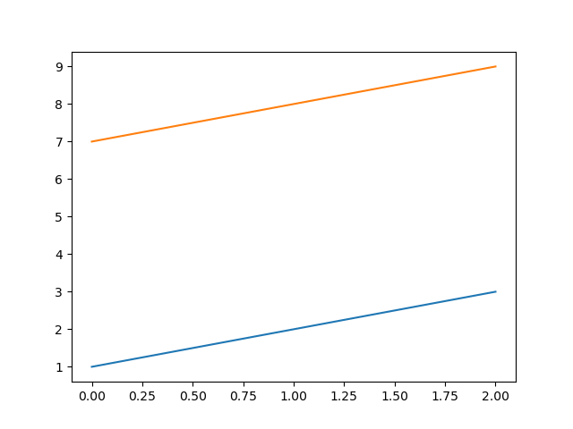
-
Ex) axis() 함수
axis() : 축의 [xmin, xmax, ymin, ymax]를 리턴
axis([xmin, xmax, ymin, ymax]) : 축의 범위를 지정
axis(‘off’) : 축과 label을 없앰
axis(‘equal’)
axis(‘scaled’)
axis(‘tight’)
axis(‘image’)
axis(‘auto’)
axis(‘normal’)
axis(‘square’)
3) size와 face color
- Figure의 크기를 조정하거나 face color를 조정
-
Ex) figure()로 생성할 때 인자로 조정
plt.figure(figsize=(10,5),facecolor='yellow')
-
Ex) 기존 figure에 함수 호출
fig = plt.gcf() # figure 객체 생성
fig.set_size_inches(10,5) # 기존 figure에 함수 호출
fig.patch.set_facecolor('white') # 기존 figure에 함수 호출
# figure의 face color가 gray일 경우 강제로 white로 지정할 수 있다.
4) savefig()
-
figure()로 그림 객체를 만든 후, savefig() 함수로 저장한다.
-
Ex)
f = plt.figure()
f.savefig('Figure_6.png') -
Ex) 고해상도
plt.savefig('f03.png',dpi=300)
5) set_aspect(), set_visible(), set_frame_on()
-
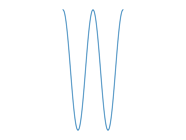
Ex) x축, y축, 프레임 없앰
import matplotlib.pyplot as plt
import numpy as npt = np.arange(0.0, 1.0 + 0.01, 0.01)
s = np.cos(2*2*np.pi*t)
plt.plot(t,s,'-',lw=2)#get current axes
ax = plt.gca()# aspect ratio
ax.set_aspect('equal', 'datalim') # x축과 y축이 같은 스케일링; 화면 limit에 맞춤# axis 없애기
ax.get_xaxis().set_visible(False)
ax.get_yaxis().set_visible(False)# frame 선 없애기
ax.set_frame_on(False)plt.tight_layout()
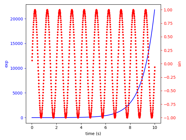
6) 두 개의 y축: ax2 = ax1.twinx()
-
Ex)
import matplotlib.pyplot as plt
import numpy as np# 첫 번째 y축 그래프
fig, ax1 = plt.subplots()
t = np.arange(0.01, 10.0, 0.01) # 동일한 x축
s1 = np.exp(t)
ax1.plot(t, s1, 'b-')ax1.set_xlabel('time (s)')
ax1.set_ylabel('exp', color='b')
ax1.tick_params('y', colors='b')# 두 번째 y축 그래프
ax2 = ax1.twinx()
s2 = np.sin(2 * np.pi * t)
ax2.plot(t, s2, 'r.')
ax2.set_ylabel('sin', color='r')
ax2.tick_params('y', colors='r')fig.tight_layout()
plt.show()
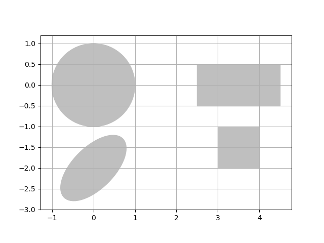
7) 도형 그리기
-
Ex)
import matplotlib.pyplot as plt # Line 그리기
import matplotlib.patches as patches # 도형 그리기
from matplotlib.path import Path # 폐곡선 그리기# circle(원형)
circle = patches.Circle((0,0),radius=1.,color = '.75')
plt.gca().add_patch(circle)#rectangle(사각형)
rect = patches.Rectangle((2.5, -.5), 2., 1., color = '.75')
plt.gca().add_patch(rect)# Ellipse(타원형)
ellipse = patches.Ellipse((0, -2.), 2., 1., angle = 45., color ='.75')
plt.gca().add_patch(ellipse)# Path(폐곡선)
verts = [ # 꼭지점 생성
(3., -2), # left, bottom
(3., -1.), # left, top
(4., -1.), # right, top
(4., -2), # right, bottom
(3., -2.), # ignored
]codes = [Path.MOVETO, # 시작점
Path.LINETO,
Path.LINETO,
Path.LINETO,
Path.CLOSEPOLY, # 폐곡선
]path = Path(verts, codes)
patch = patches.PathPatch(path, color='.75')
plt.gca().add_patch(patch)plt.gca().set_xlim(-2,2) # x축 범위: (-2,2)
plt.gca().set_ylim(-2,2) # y축 범위: (-2,2)plt.axis('scaled') # 모든 그림을 나타내도록 axis 범위를 조절
plt.grid(True)
plt.show()
8) subplot 위치 및 크기 조정: subplot2grid()
-
Ex)
import matplotlib.pyplot as pltax1 = plt.subplot2grid((3, 3), (0, 0), colspan=3)
plt.text(0.5,0.5,r'ax1')ax2 = plt.subplot2grid((3, 3), (1, 0), colspan=2)
plt.text(0.5,0.5,r'ax2')ax3 = plt.subplot2grid((3, 3), (1, 2), rowspan=2)
plt.text(0.5,0.5,r'ax3')ax4 = plt.subplot2grid((3, 3), (2, 0))
plt.text(0.5,0.5,r'ax4')ax5 = plt.subplot2grid((3, 3), (2, 1))
plt.text(0.5,0.5,r'ax5')plt.show()
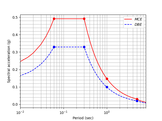
9) 대수그래프: plt.xscale("log")
-
Ex)
import matplotlib.pyplot as plt
import numpy as npRS = np.loadtxt('RS_S1.txt', skiprows=1,
dtype={'names': ('T', 'DBE', 'MCE'), 'formats': ('f4', 'f4', 'f4')})
RSp= np.loadtxt('RS_S1p.txt', skiprows=1,
dtype={'names': ('T', 'DBE', 'MCE'), 'formats': ('f4', 'f4', 'f4')})plt.plot(RS['T'],RS['MCE'],'r',label=r'$MCE$')
plt.plot(RS['T'],RS['DBE'],'b--',label=r'$DBE$')
plt.plot(RSp['T'],RSp['MCE'],'ro')
plt.plot(RSp['T'],RSp['DBE'],'bo')plt.legend(loc='upper right')
plt.xlabel('Period (sec)')
plt.xlim([0.01,8])
plt.xscale("log")
plt.ylabel('Spectral acceleration (g)')
plt.minorticks_on()
plt.grid(True,which='both')
plt.show()